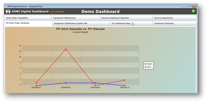
Line Chart
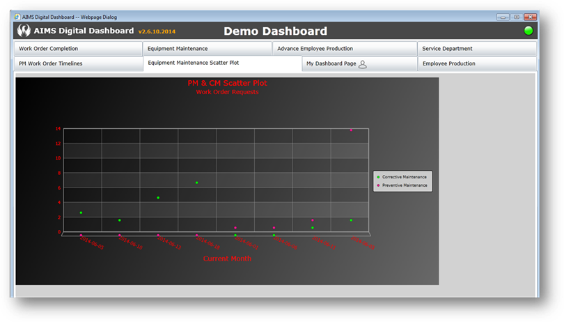
Point Chart
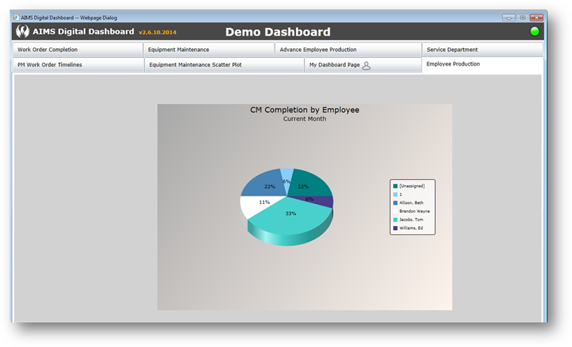
Pie Chart
Pie Chart Additional Property Settings
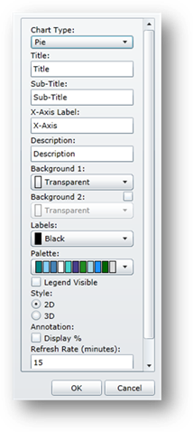
1. Style – Select 2D or 3D.
2. Annotation – Check to display the actual percentage of each pie section.
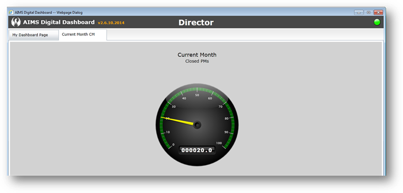
Gauge Chart
Gauge Chart Additional Property Settings
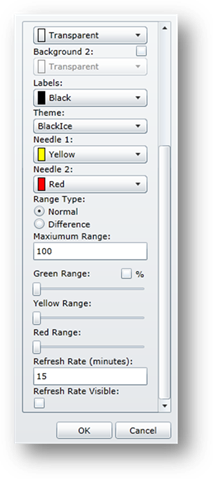
1. Theme – Select from the drop down list.
2. Needle 1 – Select a color.
3. Needle 2 – Select a color.
4. Range Type – Select one: Normal displays the entire gauge range in color; Difference displays the gauge range in color only between the needles.
5. Maximum Range – Enter a value for the maximum range displayed on the gauge.
6. Normal Range Selections:
Green Range – Slide the bar to the desired range for Green (“Good”).
Yellow Range – Slide the bar to the desired range for Yellow (“Caution”).
Red Range – Slide the bar to the desired range for Red (“Danger”).
7. Difference Range Selections:
Range 1 – Green (“Good”) – Enter the data points.
Range 2 – Yellow (“Caution”) – Enter the data points.
Range 3 – Red (“Danger”) – Enter the data points.